ForeCash – FinTech Experience Case Study
ForeCash is a personal finance forecasting tool designed to help users plan, track, and achieve financial goals with ease. The aim was to make complex financial data simple, human, and actionable with AI-powered guidance.
Duration
6 weeks
Industry
Fintech
Products
Mobile app
Web dashboard
Onboarding website


Problem
Statement
Many individuals, especially young adults and gig workers, find it difficult to manage their money in a way that aligns with their long- term goals.
Traditional budgeting tools often focus on tracking spending but fail to guide users with purpose or help them stay motivated.
People know what they earn and what they spend, but they struggle with saving intentionally or working toward meaningful milestones like starting a business, paying off student debt, or travelling the world.

Discovery
I noticed a recurring behavior on platforms like Reddit, where people are coming up with apps that uses AI for businesses, expense tracker etc. These types of apps and posts got me thinking.
What if there is an app/website that works just for the users, their finances and come up with forecasted plans to make sure that they get what they want!?


Requirements
Based on the discoveries obtained, I started formulating the contents as to what the users really want to see in this website/app. These things came to my mind:
An interactive AI to ask for financial advices
Clear visual of their finances
Set specific targets they want to achieve using the AI chat
Keep track of their progress of a specific target/goal
Adjust their plan according to circumstances
Show clear data of the user’s transaction history
Show how much they owe and how much they are owed from people
Keep the chat minimalistic and to the point content/forecasting
Clear and easy to navigate onboarding experience

Ideation
Based on the discoveries obtained, I started formulating the contents as to what the users really want to see in this website/app. These things came to my mind:
An interactive AI to ask for financial advices
Clear visual of their finances
Set specific targets they want to achieve using the AI chat
Keep track of their progress of a specific target/goal
Adjust their plan according to circumstances
Show clear data of the user’s transaction history
Show how much they owe and how much they are owed from people
Keep the chat minimalistic and to the point content/forecasting
Clear and easy to navigate onboarding experience

Usability Tests
I conducted usability tests with target users to validate design decisions and identify areas for improvement. The test consisted of an interview and completing specific task on an AI chat box in banking and financial wellness apps.

Usability Test #1- Erica AI (BOA)
"I tried asking the AI about my financial goals in my own words,
but it only offered a few preset questions to choose from.
When I typed anything outside those options, it could not give me an answer."
Usability testing showed that limiting user input to predefined selections reduces the usefulness of an AI assistant. Financial needs are often unique, and users expect the freedom to phrase questions naturally. When the system fails to respond to anything beyond its scope, it creates frustration and prevents deeper engagement with the tool.

"Usability Test #2- Cloe AI"
"The AI responds in a friendly and engaging way, but it cannot give me a personalized forecast or plan based on my specific situation.
It feels like I am getting generic advice instead of something tailored to me."
Testing revealed that while personality and engagement are strengths, the absence of personalized forecasting leaves a significant gap for users who want actionable, data-driven insights. Financial wellness tools must go beyond general tips and provide tailored strategies that help users reach their individual goals.
Affinity Mapping
The affinity mapping exercise distilled diverse user insights into clear, actionable themes. By organizing feedback into clusters, we identified the most pressing financial needs, behavioral patterns, and emotional triggers that influence decision-making.
These groupings revealed not only what features users expect from a personal financial development tool, but also how they naturally progress through their relationship with it from initial awareness to active engagement.
This understanding formed the foundation for building ForeCash’s Customer Journey Map, ensuring each stage addresses a real and validated user need.

User persona
I created Emily based on usability tests and affinity mapping, representing busy young professionals who lack time for financial planning. She reflects frustrations with generic apps and the need for a simple, personalized tool to set and track goals.

Solutions
The feedback from usability testing shaped the final iteration of ForeCash into a platform that not only forecasts savings but actively motivates users to achieve their biggest financial goals.

AI-Centered Experience
The design placed an AI-driven chat at the core, enabling users to type or speak naturally, receive personalized step-by-step plans, and adjust them as priorities changed. A streamlined dashboard delivered instant insights into goal progress, transactions, upcoming payments, and shared expenses.

Seamless Across Devices
The interface maintained consistency across web and mobile, ensuring a familiar, fluid experience whether planning a purchase at home or checking budgets on the go.

Tracker to Digital Partner
ForeCash evolved into an adaptive partner, driving higher engagement through frequent goal updates and personalized insights.

Savings Goal
Users could set goals, like saving for travel or paying off loans, link them to spending habits, and track progress with milestones and AI suggestions.
Design System
I created the ForeCash design system to ensure clarity and consistency across the platform. I chose a warm, professional color palette with clear feedback states, a clean sans-serif type for readability, and rounded components with subtle shadows for a modern feel. Simple icons, customizable avatars, and a streamlined navigation bar make the experience approachable, while progress indicators keep users motivated.


Onboarding
I designed two versions of onboarding:
Authentic version → Clean, minimal screens focused on clarity and functionality, guiding the user with simple messaging and clear login/permission steps.
Illustrated version → Flashy visuals with playful illustrations and subtle motion design, creating a more engaging and expressive experience.

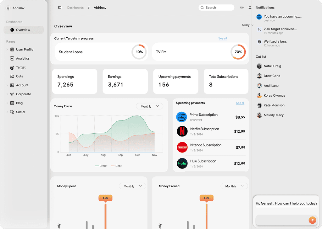
Authentication & Dashboard
The login, registration, and OTP flows are simple and secure, leading into a motivating success screen. The dashboard gives users a clear overview of their balance, subscriptions, and recent transactions.

Goals &
Transactions
Users can set financial goals with progress tracking and edit them anytime. Adding transactions is intuitive with categories, payment methods, and confirmation to avoid mistakes.

Profile, Security & Analytics
Profile settings cover personalization, security, and document storage. Analytics provide insights into spending patterns and link them back to personal savings goals with visual clarity.

AI Interaction
The AI video demonstrates how conversational assistance guides users with smart suggestions, reminders, and financial nudges, blending automation with a human-like experience.
Final
The feedback from usability testing shaped the final iteration of ForeCash into a platform that not only forecasts savings but actively motivates users to achieve their biggest financial goals.