Blockstalker.io
Blockstalker is a blockchain-based platform helping users track and manage their cryptocurrency assets. While the backend was powerful, user research revealed that new users found the onboarding experience confusing and the product hard to navigate — especially users new to crypto.
Tool
Figma, Miro
Team
2 UX Design Interns
Role
UX Design Intern
Duration
4 Week
Client
https://blockstalker.io/
Problem statement 🔍
New users, particularly those without technical crypto knowledge, faced friction in understanding the value proposition and completing setup. The interface lacked clear guidance, context, and hierarchy — which led to high bounce rates.
Goal 🎯
Make the onboarding journey simpler and more understandable for first-time users, especially non-technical ones, to increase retention and task completion.
Also need to work on the UI to improve the design system for later use.
My Contributions
Conducted UX audits and competitor analysis
Collaborated with stakeholders to define onboarding goals
Created a clarified onboarding flow and redesigned home page wireframes
Designed contextual tooltips and progressive disclosure for complex concepts
Presented mockups to stakeholders weekly for feedback and iteration
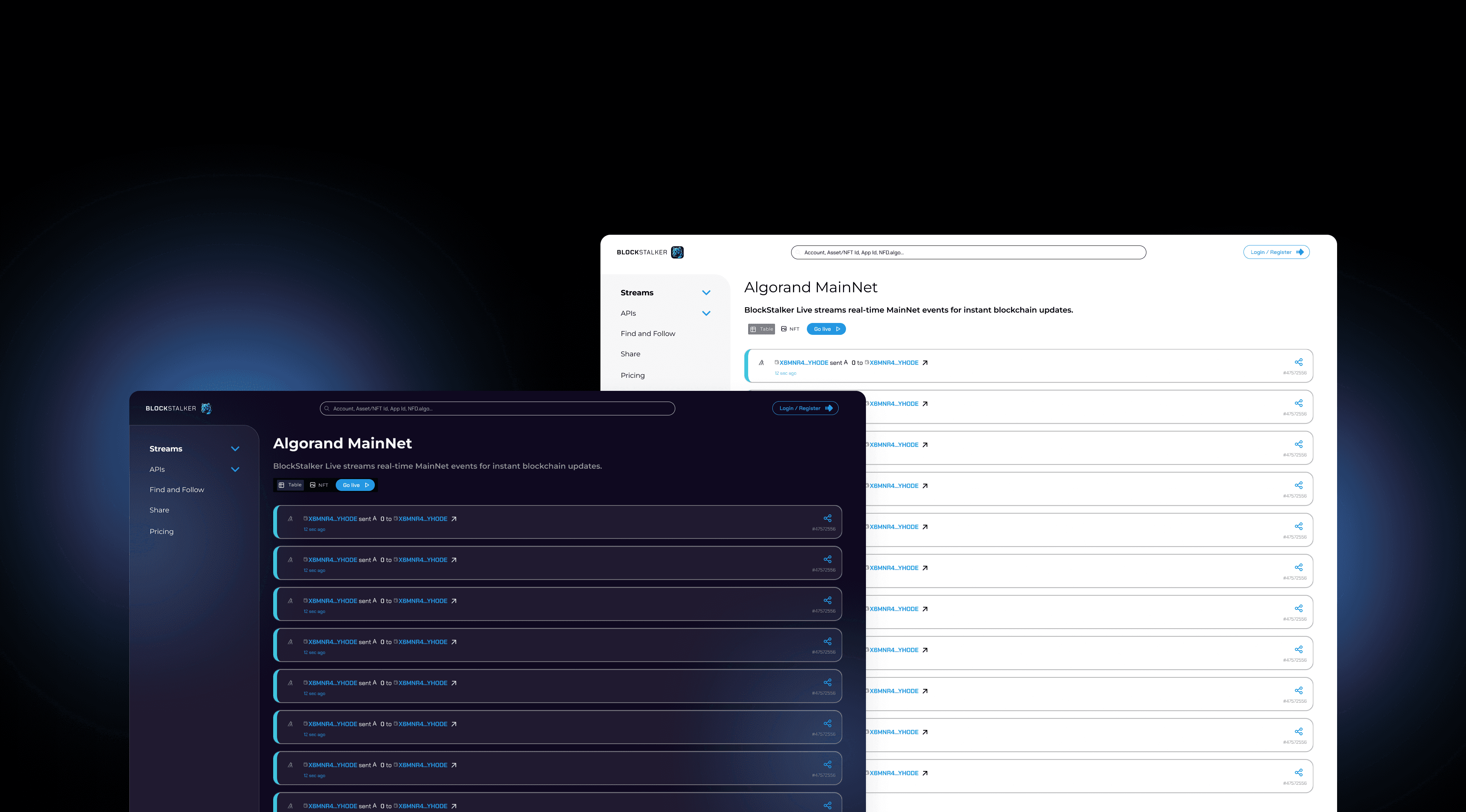
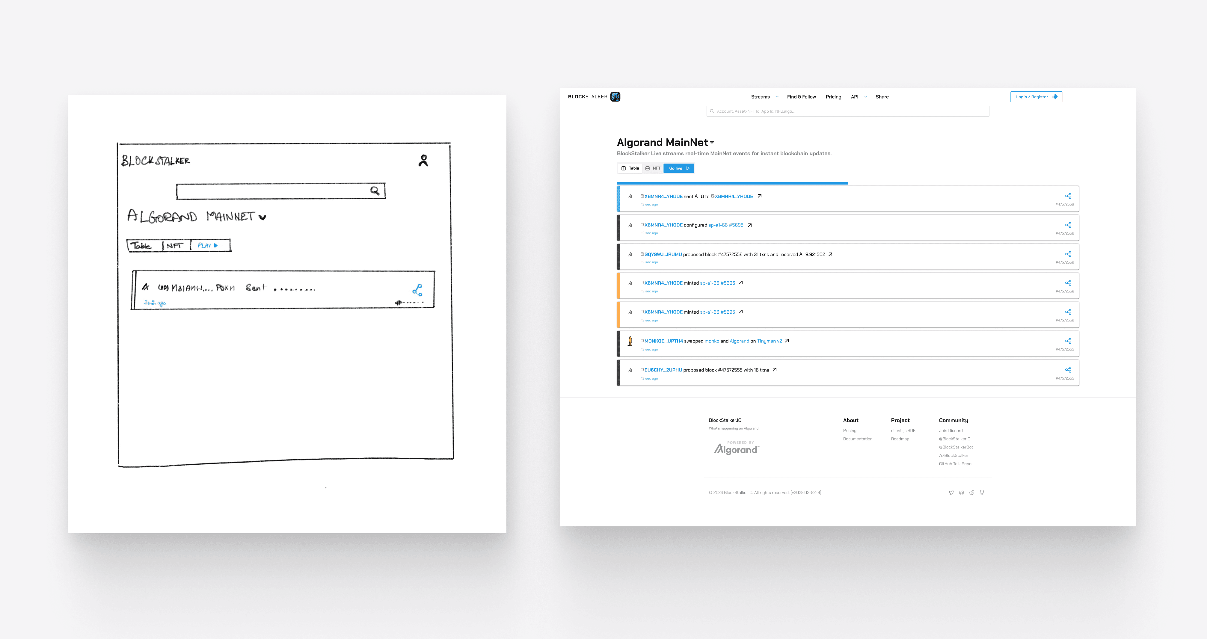
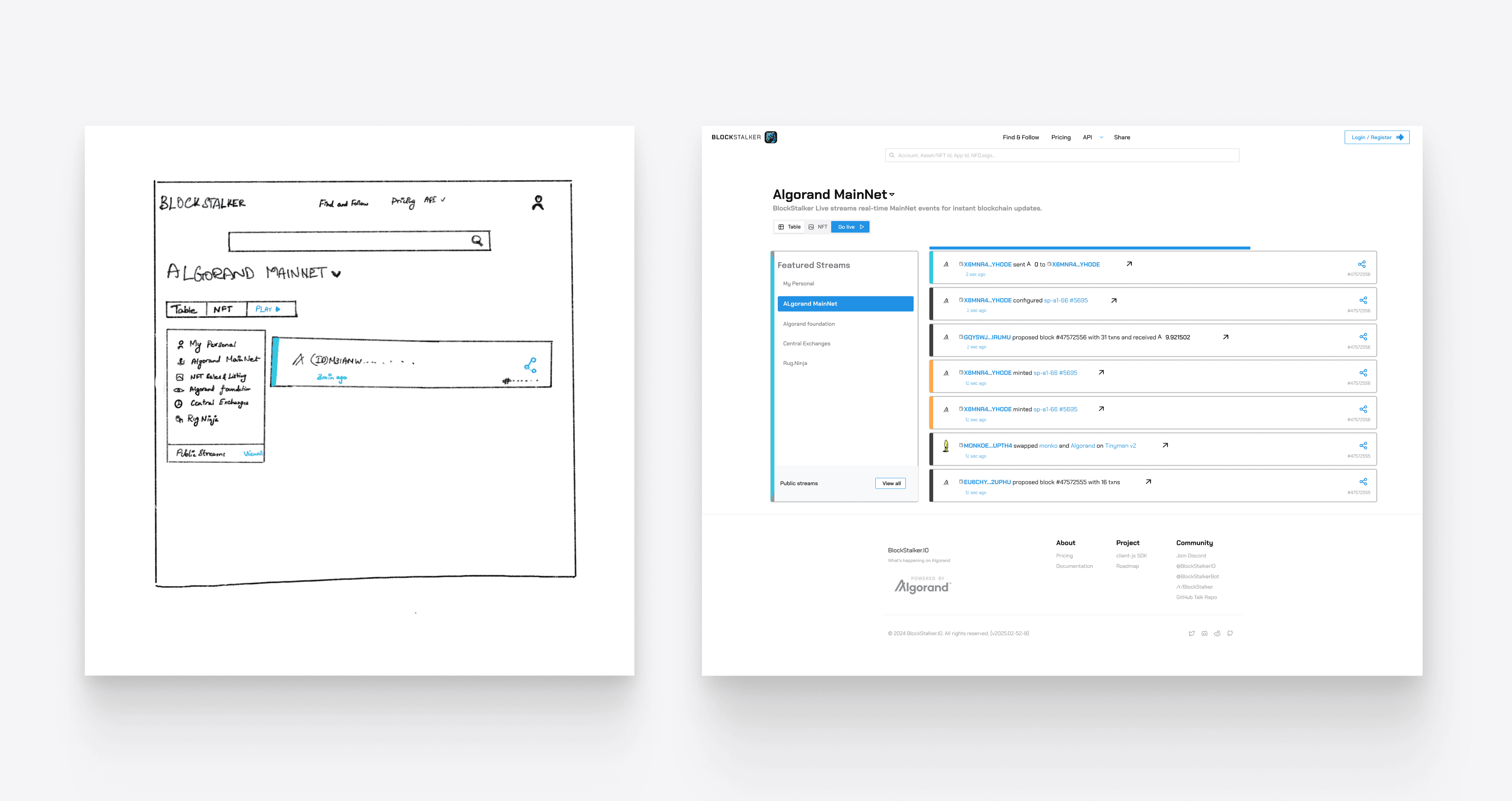
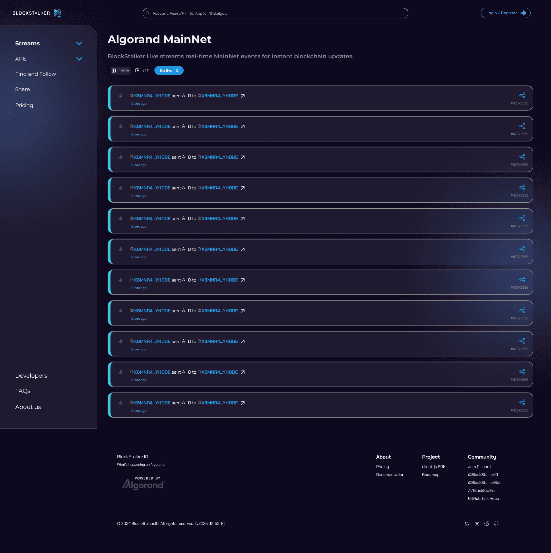
Original Version

Process Overview
Week 1
Research & Understanding the Problem
Heuristic evaluation of existing onboarding
Spoke to stakeholders to gather key insights
Mapped out user frustration points with current flow
Week 2
Ideation & Wireframing
Sketched improved information hierarchy
Introduced educational microcopy and icons to demystify terms like “wallet” or “staking”
Proposed a 3-step simplified onboarding flow
Week 3–4
High-Fidelity Design & Iteration
Created high-fidelity mockups in Figma
Added a “Beginner Mode” toggle for simplified UI
Received iterative feedback and made changes accordingly
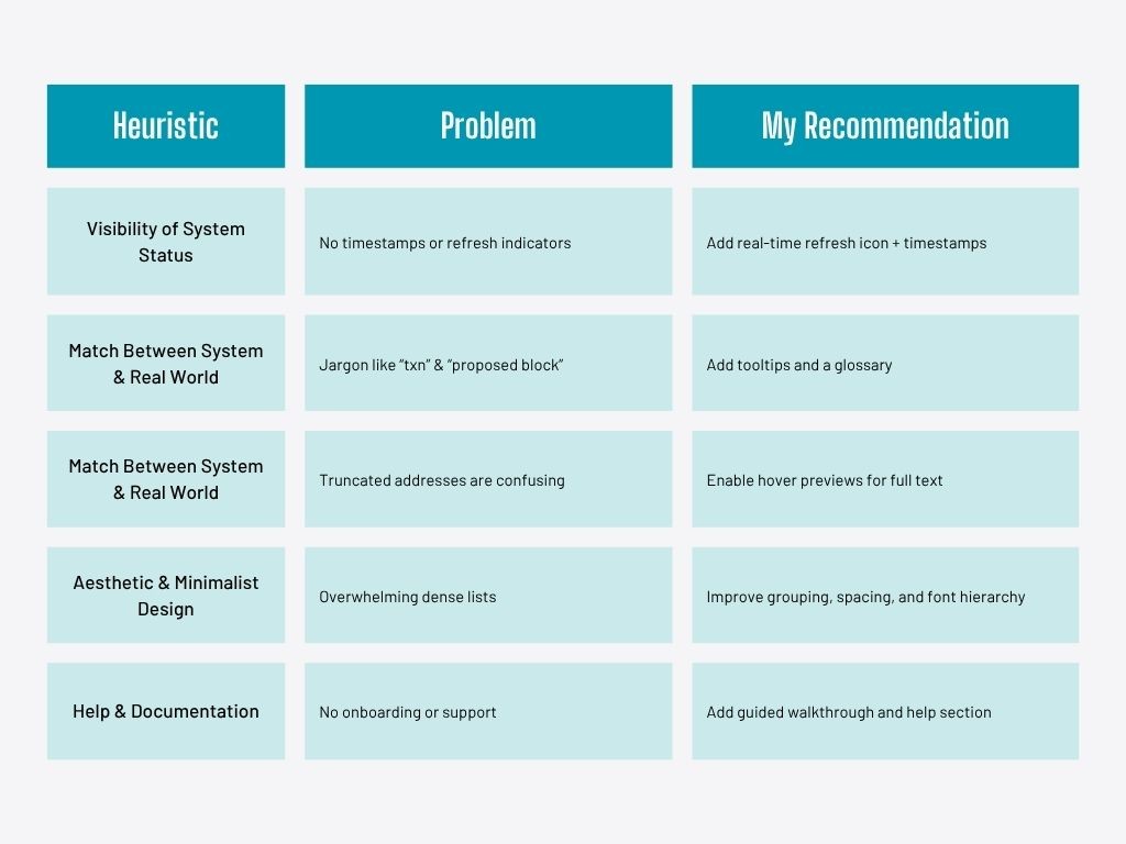
UX Research & Insights
I conducted desk research first to get to know about the dashboard,
since I got no idea about blockstalker initially. Then conducted
heuristic evaluation based on Nelson Norman 10 Heuristic principles,
and gave stakeholder a brief Idea about the present issues.
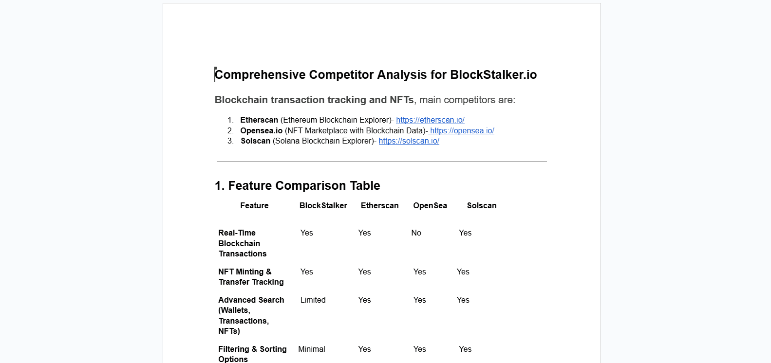
🧩 Competitor Analysis
Blockstalker stands out with its real-time blockchain tracking, dark
mode UI, and support for both transactions and NFTs, making it
developer-friendly with its accessible API. However, it falls short in
key areas like mobile optimization, search and filtering, user
onboarding, and accessibility. Compared to competitors like
Etherscan, OpenSea, and Solscan, the platform feels dense and
overwhelming, especially for beginners.
To stay competitive, Blockstalker should focus on improving mobile
responsiveness, adding onboarding guides, enhancing filter/search
options, and addressing accessibility issues to create a more inclusive
and user-friendly experience.
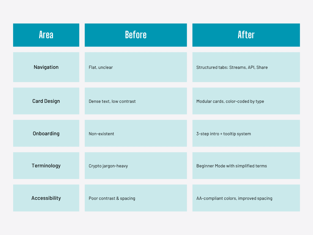
✨ Key UI Improvements
I redesigned the UI to improve clarity, usability, and accessibility.
Navigation was simplified with clearer tabs, and transaction cards
were enhanced using color-coded indicators and icons. A “Beginner
Mode” with tooltips was introduced to support non-technical users.
The layout was made more readable with better spacing, hierarchy,
and both dark/light themes for visual comfort.
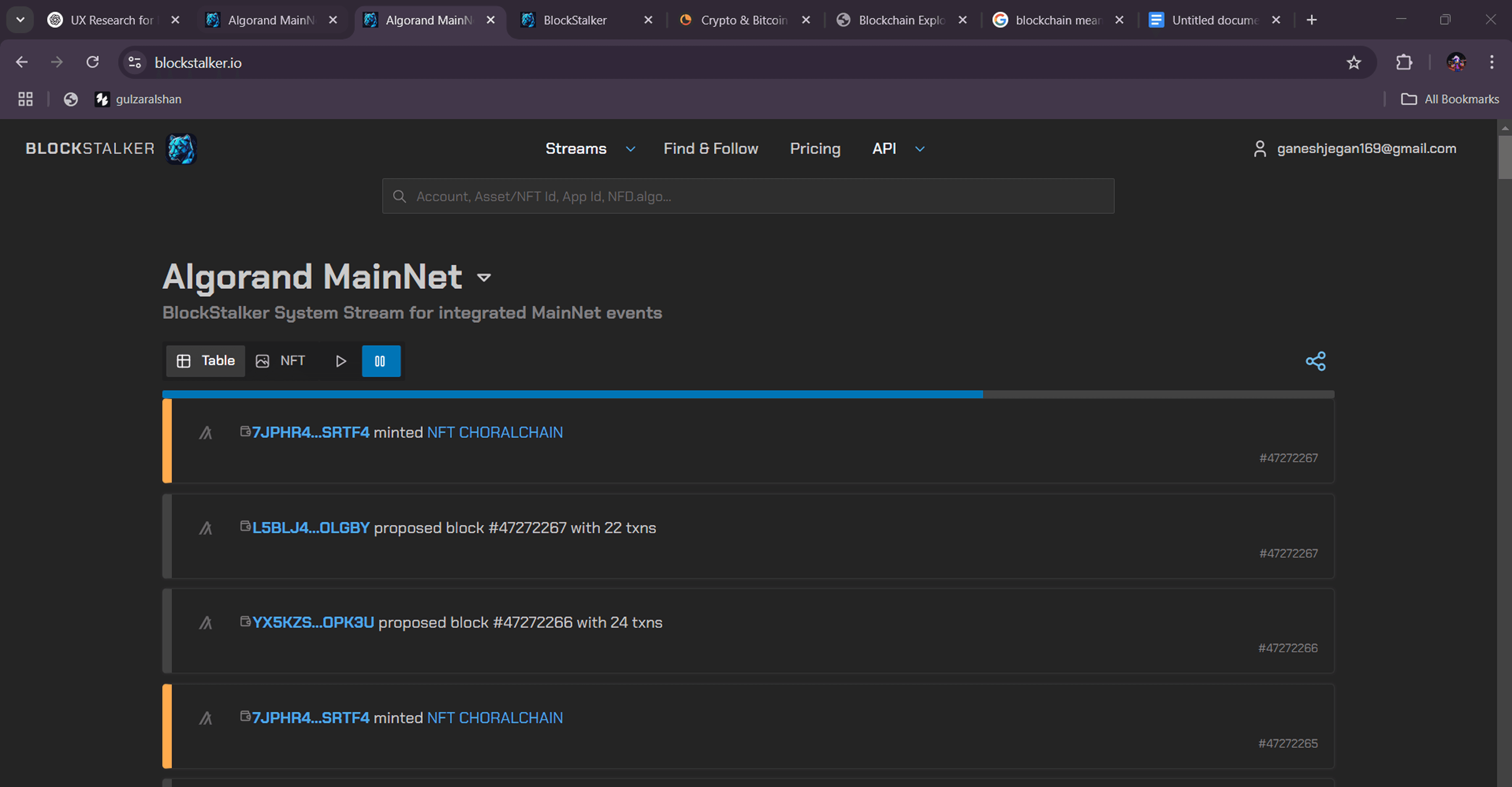
Initial Design
📈 Outcome ands takeaway
Within just four weeks, I quickly grasped complex blockchain concepts and applied UX principles to redesign key areas of the platform. The updated UI significantly improved usability and clarity, especially for new users. Stakeholders were highly satisfied with the results, noting a clearer interface, better user flow, and a more polished overall experience. My ability to adapt quickly and deliver meaningful improvements in a short time was well appreciated.

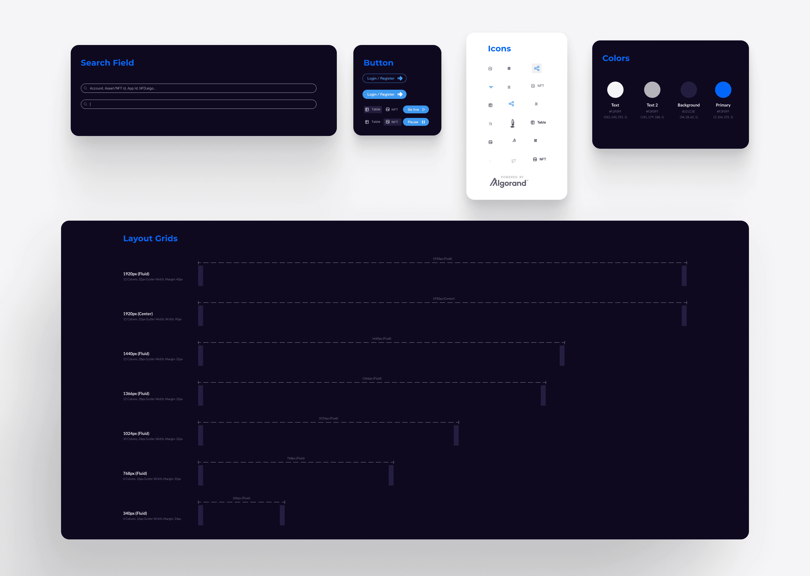
Design Systems
I built a modular design system in Figma with reusable components,
consistent typography, and responsive layouts. It streamlined collaboration,
ensured visual consistency, and made future updates faster and more scalable.

Moments App
Finding the perfect photographer can be daunting, with users struggling to match vision and budget. That’s where Moments steps in-connecting clients effortlessly with photographers who fit their style and needs.

Real Challenge
How might we simplify finding and booking trusted photographers, making the experience effortless and memorable?
Goal
Create a seamless, trusted platform that simplifies booking photographers, enhances user connections, and offers personalized, secure, and efficient experiences from search to post-event delivery
Desk Research
The Struggle is Real: Tales of a
Photographer’s Daily Grind
Fear of promoting services leads to missed client opportunities.
Challenges in getting noticed and connecting with target clients.
Unprofessional booking methods and unclear contact processes hinder conversions.
Struggle to build trust and stand out in a crowded market.
Why This App Idea is in
High Demand
U.S. photography market size reached $12.9 billion in 2023.
Clients frequently request photoshoots with less than two weeks’ notice.
38% of Americans take photos primarily for social sharing.
9% increase in professional photography demand expected by 2028.
The Ultimate Photographer
Struggle Survey
At the start of the Moments app project, I decided to play detective and get to know our users through a well-crafted survey. I mixed open-ended and multiple-choice questions to gather a treasure trove of data.
The survey went viral in our target groups, racking up 30 responses faster than you can say "cheese!". Armed with these insights, I dove into the ideation phase, making sure the app was fine-tuned
to meet the real needs of our users.
Click here for more information

Snap Judgments-
Ideation Blitz💡
The brainstorming section outlines key features like booking and profile viewing, along with design principles focusing on usability, simplicity, and security for the Moments App.

Click Path-
The User Journey👣
The user flow is designed for seamless navigation, ensuring users can easily find and book photographers without any hassle, focusing solely on capturing their perfect moments.

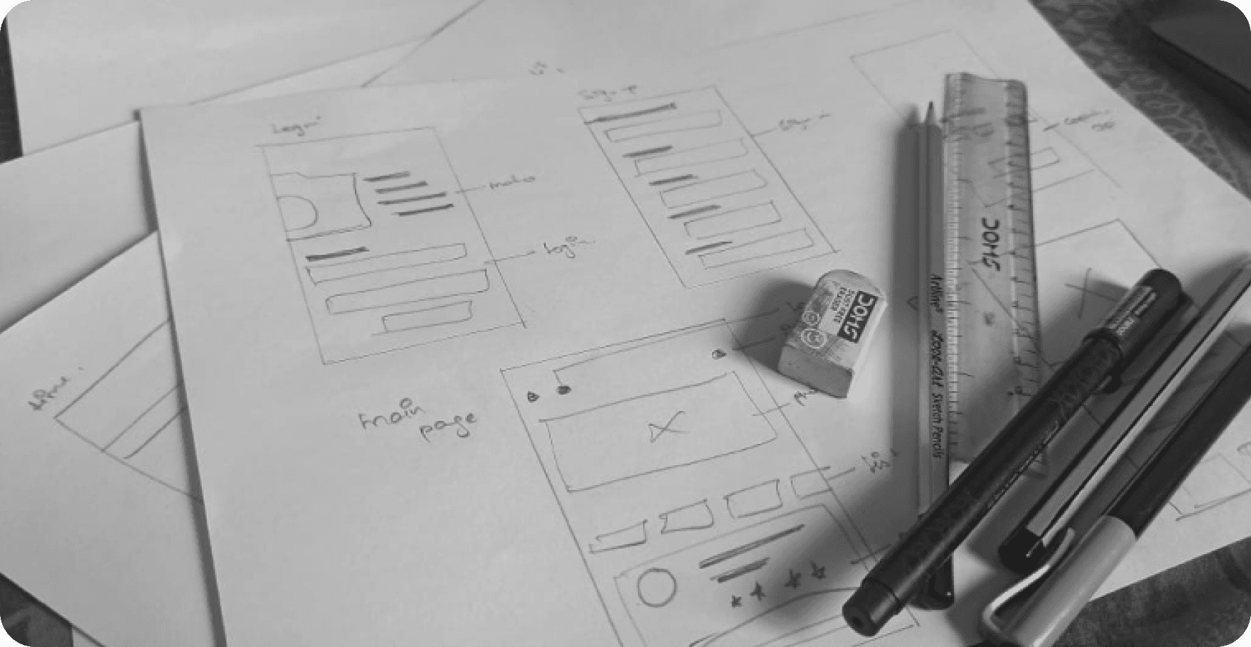
Doodle Mode:
Sketching It Out✏️
Design Calls:
Pre-Master’s Journey
Design Calls:
POST-Master’s Journey
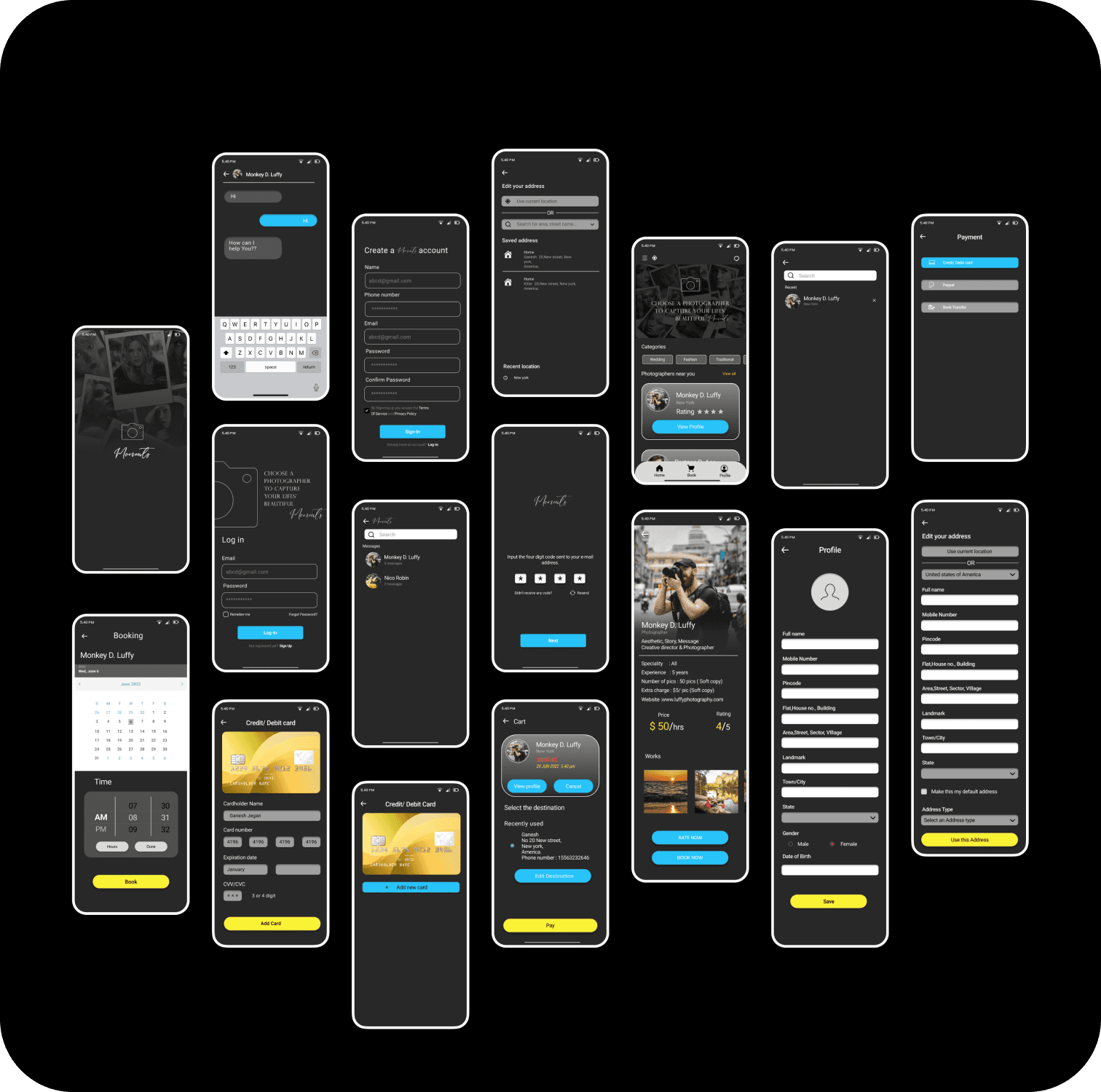
And voila! After all the sketches, wireframes, and countless tweaks,
the Moments App emerged like a butterfly from its cocoon. The final output was a sleek, user-friendly masterpiece that made finding and booking photographers as easy as snapping a selfie.📸✨
Reflection
Through this project, my empathy and understanding of user needs have significantly deepened. Looking back, I'd benefit from observing users interact with the app in real life to gain clearer insights into their experiences.
This experience has reinforced my commitment to never stop improving the app, embracing the ongoing journey of a UX designer to continuously enhance user experiences.
Moments App
Finding the perfect photographer can be daunting, with users struggling to match vision and budget. That’s where Moments steps in-connecting clients effortlessly with photographers who fit their style and needs.
Desk Research
The Struggle is Real: Tales of a
Photographer’s Daily Grind
Fear of promoting services leads to missed client opportunities.
Challenges in getting noticed and connecting with target clients.
Unprofessional booking methods and unclear contact processes hinder conversions.
Struggle to build trust and stand out in a crowded market.
Why This App Idea is in
High Demand
U.S. photography market size reached $12.9 billion in 2023.
Clients frequently request photoshoots with less than two weeks’ notice.
38% of Americans take photos primarily for social sharing.
9% increase in professional photography demand expected by 2028.
User Survey
At the start of the Moments app project, I decided to play detective
and get to know our users through a well-crafted survey. I mixed
open-ended and multiple-choice questions to gather a treasure
trove of data.
The survey went viral in our target groups, racking up 30 responses
faster than you can say "cheese!". Armed with these insights, I
dove into the ideation phase, making sure the app was fine-tuned
to meet the real needs of our users.
Click here for more information
Real Challenge
How might we simplify finding and booking trusted photographers, making the experience effortless and memorable?
Goal
Create a seamless, trusted platform that simplifies booking photographers, enhances user connections, and offers personalized, secure, and efficient experiences from search to post-event delivery
Ideation💡
The brainstorming section outlines key features like booking and profile viewing, along with design principles focusing on usability, simplicity, and security for the Moments App.
User Journey👣
The user flow is designed for seamless navigation, ensuring users can easily find and book photographers without any hassle, focusing solely on capturing their perfect moments.
Doodle Mode:
Sketching It Out✏️
Design Calls:
Pre-Master’s Journey
Design Calls:
POST-Master’s Journey
Reflection on Project Growth
and Design Evaluation
Before starting my master’s program, my approach to design was more intuition-driven, lacking the structured user research and testing methods I’ve now learned. Back then, I focused mainly on visual appeal and basic usability. However, after gaining deeper insights into UX through my graduate studies, I realized the gaps in my early work.
Since entering the master’s program, I’ve transformed my design process by incorporating user feedback, empathy mapping, and real-world usability testing. These techniques have allowed me to refine the app beyond aesthetics, ensuring it meets the actual needs of users.
This journey has deepened my commitment to creating user-centered solutions, and I’m excited to continue leveraging my new skills to make impactful, research-backed design improvements.
And voila! After all the sketches, wireframes, and countless tweaks,
the Moments App emerged like a butterfly from its cocoon. The
final output was a sleek, user-friendly masterpiece that made finding
and booking photographers as easy as snapping a selfie.📸✨